Note
Go to the end to download the full example code
Multi-Line Chart
Examples of multi-line chart function multi_linechart(). The number of lines to be plotted is automatically determined from the columns in the input dataframe. Also includes the option to display one or more shaded regions with labels.
import rick
import matplotlib.pyplot as plt
import pandas as pd
import numpy as np
import datetime
Data Collection
This Section creates example data.
# x-axis
dt=[datetime.date(2020, 10, 27), datetime.date(2020, 10, 28), datetime.date(2020, 10, 29),
    datetime.date(2020, 10, 30), datetime.date(2020, 10, 31), datetime.date(2020, 11, 1),
    datetime.date(2020, 11, 2), datetime.date(2020, 11, 3), datetime.date(2020, 11, 4),
    datetime.date(2020, 11, 5), datetime.date(2020, 11, 6), datetime.date(2020, 11, 7),
    datetime.date(2020, 11, 8), datetime.date(2020, 11, 9), datetime.date(2020, 11, 10),
    datetime.date(2020, 11, 11), datetime.date(2020, 11, 12), datetime.date(2020, 11, 13),
    datetime.date(2020, 11, 14), datetime.date(2020, 11, 15), datetime.date(2020, 11, 16),
    datetime.date(2020, 11, 17), datetime.date(2020, 11, 18), datetime.date(2020, 11, 19),
    datetime.date(2020, 11, 20), datetime.date(2020, 11, 21), datetime.date(2020, 11, 22),
    datetime.date(2020, 11, 23), datetime.date(2020, 11, 24), datetime.date(2020, 11, 25),
    datetime.date(2020, 11, 26), datetime.date(2020, 11, 27), datetime.date(2020, 11, 28),
    datetime.date(2020, 11, 29), datetime.date(2020, 11, 30), datetime.date(2020, 12, 1),
    datetime.date(2020, 12, 2), datetime.date(2020, 12, 3), datetime.date(2020, 12, 4),
    datetime.date(2020, 12, 5), datetime.date(2020, 12, 6), datetime.date(2020, 12, 7),
    datetime.date(2020, 12, 8), datetime.date(2020, 12, 9), datetime.date(2020, 12, 10),
    datetime.date(2020, 12, 11), datetime.date(2020, 12, 12), datetime.date(2020, 12, 13)]

# y-axis
# line 1
y1=[32512.0, 34852.0, 35136.0, 38154.0, 35551.0, 27617.0, 33677.0, 34163.0, 34606.0, 35106.0, 38034.0, 36077.0, 30372.0, 34616.0, 34264.0, 34162.0, 34891.0, 36871.0, 34465.0, 25836.0, 41818.0, 42943.0, 42199.0, 44307.0, 49460.0, 47071.0, 31263.0, 38039.0, 39162.0, 29431.0, 42445.0, 45586.0, 42333.0, 35198.0, 39244.0, 38740.0, 41345.0, 43083.0, 43299.0, 41210.0, 32797.0, 40363.0, 41577.0, 38094.0, 43813.0, 46515.0, 38156.0, 28232.0]

# line 2
y2=[38781.0, 41387.0, 40545.0, 42473.0, 35726.0, 28066.0, 36873.0, 38191.0, 39432.0, 40123.0, 42199.0, 37404.0, 32564.0, 38425.0, 40460.0, 39506.0, 39780.0, 40666.0, 34904.0, 25290.0, 35852.0, 37037.0, 36880.0, 38007.0, 40274.0, 35163.0, 23323.0, 33689.0, 35129.0, 12352.0, 36524.0, 38759.0, 32995.0, 29132.0, 33974.0, 32964.0, 35851.0, 37296.0, 36458.0, 31332.0, 26148.0, 34649.0, 35588.0, 34950.0, 36615.0, 38317.0, 29245.0, 21929.0]

# line 3
y3=[21713.0, 23644.0, 22949.0, 24473.0, 21201.0, 16189.0, 21592.0, 21946.0, 23200.0, 23324.0, 25188.0, 23107.0, 20544.0, 23035.0, 24334.0, 23354.0, 23144.0, 23411.0, 20691.0, 14232.0, 20965.0, 21615.0, 20784.0, 21851.0, 24003.0, 20617.0, 13727.0, 19809.0, 20124.0, 8755.0, 20952.0, 22788.0, 20327.0, 17183.0, 19609.0, 19223.0, 20557.0, 21295.0, 20377.0, 17362.0, 14867.0, 19576.0, 20172.0, 19520.0, 20884.0, 22209.0, 16241.0, 12449.0]

# Create dataframe to be plotted
data = {'dt':dt, 'y1':y1, 'y2':y2, 'y3':y3}
df_multi = pd.DataFrame(data)
df_multi_dt = df_multi.set_index('dt')
df_multi_dt.index = pd.to_datetime(df_multi_dt.index)
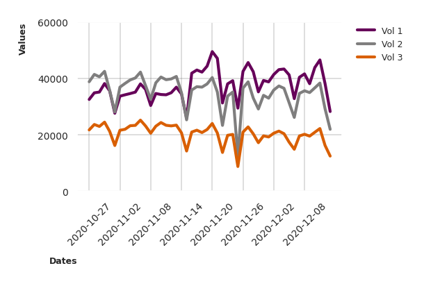
Example: plot data with multiline function
This section plots the df_multi dataframe using the rewrite of the multiline function.
fig, ax = rick.charts.multi_linechart(
    data=df_multi_dt,
    ylab='Values',
    xlab='Dates',
    legend=['Vol 1', 'Vol 2', 'Vol 3'])
fig.tight_layout()
plt.show()
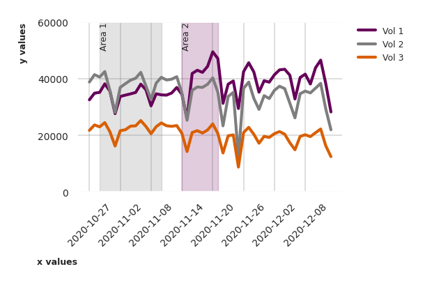
Example: multiline function with shaded areas
This section adds two example shaded areas. For the first area, the colour is left as None, so it defaults to grey. For the second area it is set to purple.
fig, ax = rick.charts.multi_linechart(df_multi_dt,
                                           ylab='y values',
                                           xlab='x values',
                                           legend=['Vol 1', 'Vol 2', 'Vol 3'],
                                           shaded_areas={('Area 1',None): (datetime.date(2020,10,29),datetime.date(2020,11,10)),
                                                         ('Area 2','#660159'): (datetime.date(2020,11,14),datetime.date(2020,11,21))})
fig.tight_layout()
plt.show()
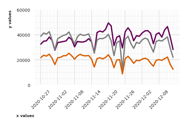
Example: multiline function with custom minor ticks
The function multi_linechart has the option of adding custom minor ticks. To do so, set the corresponding bool flag (minor_x or minor_y) to True, and optionally set the frequency of minor ticks with num_minor_x or num_minor_y.
fig, ax = rick.charts.multi_linechart(
    df_multi_dt,
    ylab='y values',
    xlab='x values',
    minor_x = True,
    minor_y = True,
    num_minor_x=10)

fig.tight_layout()
plt.show()
Total running time of the script: (0 minutes 0.890 seconds)