Note
Click here to download the full example code
RICK Line Chart
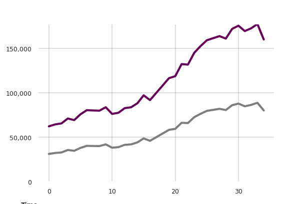
Example line chart from the RICK package, with an additional baseline plot and custom formatted x axis.
from sqlalchemy import create_engine
import matplotlib.pyplot as plt
import matplotlib as mpl
import pandas as pd
import configparser
from psycopg2 import connect
import psycopg2.sql as pg
import pandas.io.sql as pandasql
import numpy as np
import datetime
import math
import rick
import geopandas as gpd
import os
import shapely
from shapely.geometry import Point
os.environ["PROJ_LIB"]=r"C:\Users\rliu4\AppData\Local\Continuum\anaconda3\Library\share"
import importlib
import matplotlib.ticker as ticker
import matplotlib.font_manager as font_manager


CONFIG = configparser.ConfigParser()
# CONFIG.read(r'C:\Users\rliu4\Documents\Python\config.cfg')
CONFIG.read(r'/home/cnangini/db.cfg')
dbset = CONFIG['DBSETTINGS']
con = connect(**dbset)
Data Collection
This Section grabs and formats the data.
query='''
WITH daily_ave AS (
   SELECT * FROM ptc.daily_trips
), total AS  (
SELECT  extract(month from dt) as mon,
extract(year from dt) as yr,

CASE WHEN extract(year from dt) = 2018 AND extract(month from dt) IN (3) THEN 108321
WHEN extract(year from dt) = 2018 AND extract(month from dt) IN (11) THEN 161733 ELSE
avg(count)::integer END as count FROM daily_ave
GROUP BY extract(month from dt), extract(year from dt)
ORDER BY extract(year from dt), extract(month from dt)
)

SELECT
CASE WHEN mon = 1 THEN to_char(to_timestamp (mon::text, 'MM'), 'Mon')||' '||yr::text
WHEN mon = 9 AND yr = 2016 THEN to_char(to_timestamp (mon::text, 'MM'), 'Mon')||' '||yr::text
ELSE to_char(to_timestamp (mon::text, 'MM'), 'Mon')
END AS period,
count FROM total
'''
total=pandasql.read_sql(query, con)
Gets the baseline data (to be graphed in grey)
query='''
WITH daily_ave AS (
SELECT * FROM ptc.daily_trips
), total AS  (
SELECT  extract(month from dt) as mon,
EXTRACT(year from dt) as yr,
CASE WHEN extract(year from dt) = 2018 AND extract(month from dt) IN (3) THEN 108321
WHEN extract(year from dt) = 2018 AND extract(month from dt) IN (11) THEN 161733 ELSE
AVG(count)::integer END AS count FROM daily_ave
GROUP BY EXTRACT(month from dt), EXTRACT(year from dt)
ORDER BY EXTRACT(year from dt), EXTRACT(month from dt)
)
SELECT
CASE WHEN mon = 1 THEN to_char(to_timestamp (mon::text, 'MM'), 'Mon')||' '||yr::text
WHEN mon = 9 AND yr = 2016 THEN to_char(to_timestamp (mon::text, 'MM'), 'Mon')||' '||yr::text
ELSE to_char(to_timestamp (mon::text, 'MM'), 'Mon')
END AS period,
count/2 AS count FROM total
'''
total2=pandasql.read_sql(query, con)

fig, ax, props = rick.charts.line_chart(total['count'], 'Trips', 'Time', baseline = total2['count'])
Adds annotations
fig.text(0.94, 0.96, '176,000', transform=ax.transAxes, wrap = True, fontsize=9, fontname = 'Libre Franklin',
         verticalalignment='top', ha = 'center', bbox=props, color = '#660159')
Out:
Text(0.94, 0.96, '176,000')
Adds custom x axis
month_lst2 = ['Sept\n2016',  'Jan\n2017',  'May',  'Sept',
               'Jan\n2018', 'May',  'Sept',
              'Jan\n2019','May',]
plt.xticks(range(0,35,4), month_lst2, fontsize=9, fontname = 'Libre Franklin')
Out:
([<matplotlib.axis.XTick object at 0x7efdced18e80>, <matplotlib.axis.XTick object at 0x7efdced18710>, <matplotlib.axis.XTick object at 0x7efdced18438>, <matplotlib.axis.XTick object at 0x7efdcecee2b0>, <matplotlib.axis.XTick object at 0x7efdcecee748>, <matplotlib.axis.XTick object at 0x7efdceceeac8>, <matplotlib.axis.XTick object at 0x7efdceceef60>, <matplotlib.axis.XTick object at 0x7efdcece44e0>, <matplotlib.axis.XTick object at 0x7efdcece49e8>], <a list of 9 Text xticklabel objects>)
Total running time of the script: ( 0 minutes 0.255 seconds)