Note
Go to the end to download the full example code
RICK Horizontal Grouped Bar Chart
Example of a horizontal grouped bar chart.
import matplotlib.pyplot as plt
import pandas as pd
import rick
Data Collection
This Section grabs and formats the data.
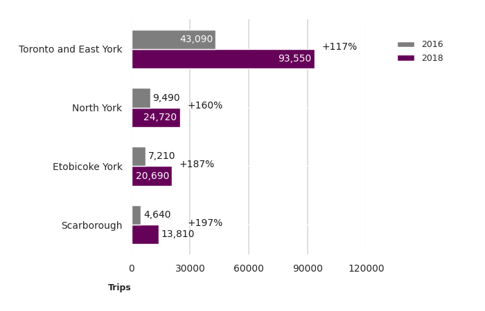
data = [["Scarborough",     4645.87, 13813.73],
        ["Etobicoke York", 7212.29, 20690.60],
        ["North York",      9494.93, 24715.76],
        ["Toronto and East York", 43089.61, 93547.43]]
district_cond = pd.DataFrame(data, columns=['area_name', 'count1', 'count2']).set_index('area_name')
Horizontal Grouped Bar Chart
This Section uses the rewritten horizontal grouped bar chart function.
# Setting a custom plot size to prevent cropping during sphinx autogeneration.
fig, ax = rick.charts.horizontal_grouped_bar_chart(
    data=district_cond,
    xlab='Trips',
    legend=['2016', '2018'],
    percent=True)
fig.set_size_inches(7, 4.5)
plt.tight_layout()
plt.show()
Total running time of the script: (0 minutes 1.322 seconds)